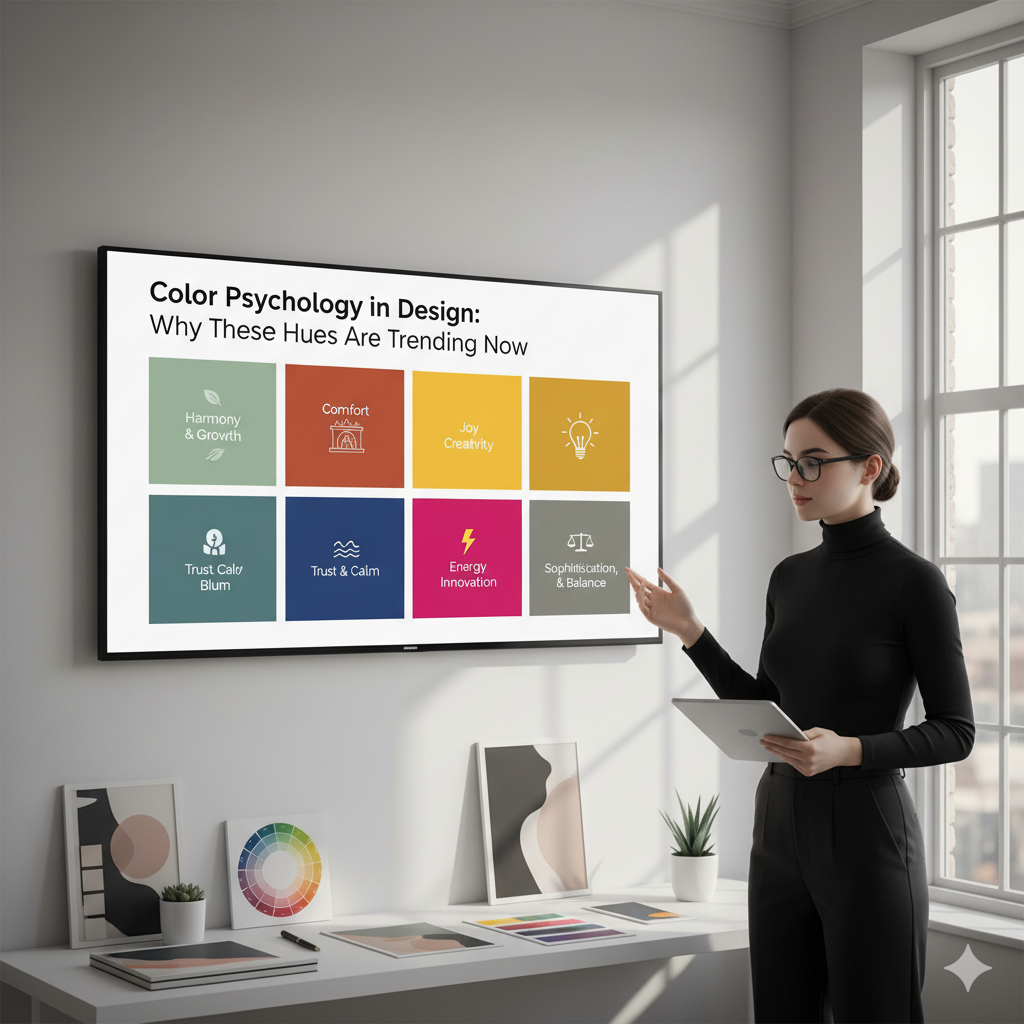
Color Psychology in Design: Why These Hues Are Trending Now
Colors do more than just look good—they influence how we feel, think, and even behave. Designers have long tapped into this power, choosing hues that create specific moods or reactions. In 2026, some colors are trending not just for their style, but because of the emotions and cultural vibes they evoke.
Let’s dive into the psychology behind the hues you’ll see everywhere this year—and why they’re resonating now.
🌿 Green: Calm, Growth & Renewal
- Shades from soft sage to deep forest green
- Associated with nature, balance, and health
- Perfect for designs that want to evoke relaxation or sustainability
Why it’s trending: In a world craving calm and eco-consciousness, green feels like a breath of fresh air.
💛 Yellow: Optimism & Energy
- Bright yellows and golden tones
- Stimulates creativity, happiness, and warmth
- Often used in branding to grab attention and inspire positivity
Why it’s trending: After a few challenging years, people want uplifting, energizing colors that spark joy.
💜 Purple: Creativity & Luxury
- From muted lavenders to rich plums
- Encourages imagination and feels sophisticated
- Popular in tech, fashion, and wellness spaces
Why it’s trending: Purple blends calm with creativity, perfect for innovation and self-expression.
🔴 Red: Passion & Action
- Bold reds and softer terracotta hues
- Evokes excitement, urgency, and confidence
- Often used to draw focus and inspire action
Why it’s trending: Red’s power to energize and motivate fits the bold spirit of 2026.
🔵 Blue: Trust & Serenity
- Soft sky blues to deep navies
- Creates a sense of calm, trust, and reliability
- Common in tech and healthcare designs
Why it’s trending: In uncertain times, blue reassures and grounds.
Wrap-Up: Designing with Emotion in Mind
These trending colors aren’t just about looks—they tap into deep emotions and cultural shifts. When you choose colors thoughtfully, you connect with your audience on a whole new level.