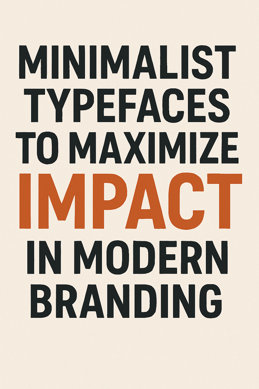
In a noisy world, less really is more—especially when it comes to branding. Minimalist typefaces strip away the extras to deliver clear, bold messages that stick. For brands looking to stay fresh and focused in 2026, these fonts are game-changers.
Here’s why minimalist fonts pack a punch—and how to choose the right one for your brand.
✨ Why Minimalist Typefaces Work
- Clarity is king: Clean lines and simple shapes make your brand easy to read and remember.
- Timeless appeal: Minimalist fonts avoid trends that quickly fade—think longevity, not flash.
- Versatility: They look great everywhere, from tiny social media icons to giant billboards.
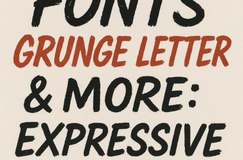
🔠 Top Minimalist Typefaces to Know
- Helvetica Neue: Classic, clean, and endlessly versatile. A go-to for brands big and small.
- Futura: Geometric shapes with a modern edge—perfect for tech or fashion brands.
- Montserrat: Friendly and approachable, with a touch of personality.
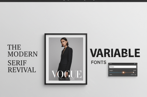
- Avenir: Sleek and elegant, great for luxury or lifestyle brands.
- Gotham: Bold but simple, excellent for making strong statements.
💡 Tips for Using Minimalist Fonts in Branding
- Pair minimalist fonts with bold colors or simple icons to create contrast.
- Use different weights (light, regular, bold) within the same font family for hierarchy.
- Keep spacing clean—white space is your friend in minimalist design.
- Avoid too many font styles; stick to one or two complementary fonts for consistency.
Wrap-Up: Make Your Brand Speak Loud & Clear
Minimalist typefaces prove that simple can be powerful. When chosen thoughtfully, they help your brand communicate with confidence and style—without shouting.