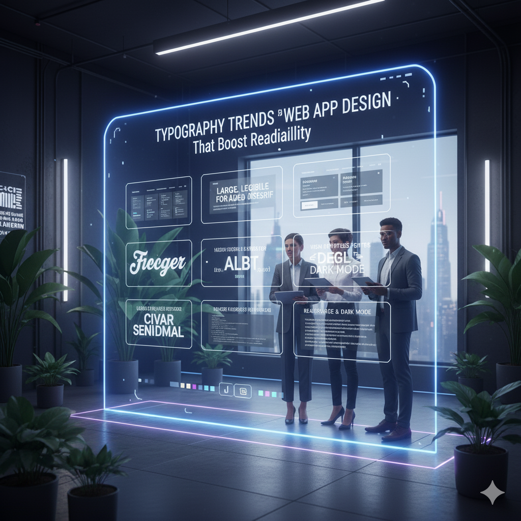
When it comes to web and app design, fonts do more than just look good—they help users actually read and engage with your content. In 2026, designers are focusing on typography that’s clear, accessible, and user-friendly across all devices.
Let’s explore the top trends making text easier (and more enjoyable) to read online.
🔠 1. Bigger, Bolder Fonts
Goodbye tiny text! Designers are embracing larger font sizes for:
- Headlines that grab attention
- Body text that’s easy on the eyes
- Buttons and calls-to-action that stand out
Why it helps: Bigger fonts reduce eye strain and improve scanning on all screen sizes.
🧱 2. Clean Sans-Serifs for Body Text
Simple, sans-serif fonts are dominating body copy because they’re crisp and modern.
- Fonts like Inter, Roboto, and Open Sans are popular choices
- They maintain clarity even at small sizes
- Great for both light and dark mode
Why it helps: Sans-serifs are versatile and super readable on digital screens.
⚖️ 3. Increased Line Height & Spacing
More breathing room around text blocks improves flow and comprehension.
- Generous line spacing prevents text from feeling cramped
- Increased letter spacing (tracking) for better legibility
- Balanced margins and padding keep layouts clean
Why it helps: Spacing reduces visual clutter and guides the reader’s eye smoothly.
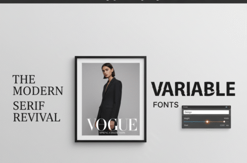
🎨 4. Variable Fonts for Responsive Design
Variable fonts adjust weight and style dynamically, adapting perfectly to screen sizes.
- Text can get bolder on small screens or lighter on large ones
- Enables smooth font animations for better UX
- Saves loading time by using a single adaptable font file
Why it helps: Responsive typography means better readability everywhere.
🖋️ 5. Accessibility-First Fonts
Fonts designed with accessibility in mind are gaining traction.
- High contrast and distinguishable letterforms
- Avoiding overly decorative or complex fonts for body text
- Supporting screen readers and assistive technologies
Why it helps: Everyone deserves a seamless reading experience.
Wrap-Up: Typography That Welcomes Everyone
Great typography in web and app design isn’t just about style—it’s about making content easy and pleasant to read. Using these 2026 trends, you can create digital experiences that keep users engaged and comfortable.