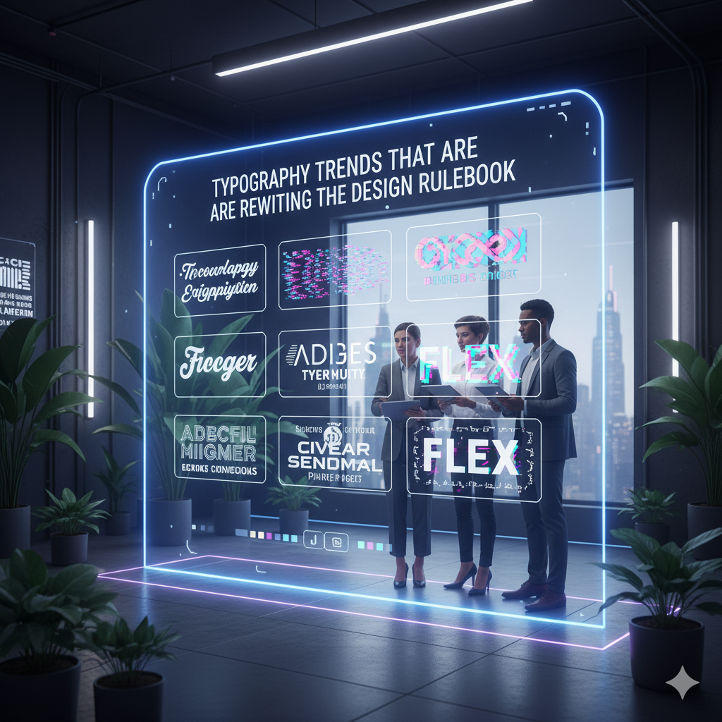
Typography has always been the backbone of design — but in 2025, it’s stealing the spotlight like never before. Forget the old rules about “readability only” and “keep it subtle.” Today’s type is bold, experimental, and downright rebellious.
Here’s how typography is breaking the mold — and what you need to know to stay ahead.
1. Oversized & In-Your-Face Type
Size matters more than ever. Huge headlines and giant typefills aren’t just for print anymore — they’re dominating screens, social media, and branding.
- Think: text that fills entire screens or sections
- Typography used as a graphic element
- Layered text overlapping images or shapes
Why it works:
Big type commands attention instantly — perfect for fast-scrolling digital audiences.
2. Warped, Stretched & Distorted Fonts
Say goodbye to perfectly neat letters. Designers are bending, twisting, and distorting type for unique textures and moods.
- Horizontal stretches and squeezes
- Wave and ripple effects
- Letterforms breaking out of their shapes
Why it works:
Distorted type creates tension and energy, adding personality without words.
3. Mixing Serif & Sans-Serif Like Never Before
Rules used to say: pick one and stick to it. Now? Designers are pairing wildly contrasting fonts to create dynamic hierarchies.
- Chunky serifs with ultra-thin sans
- Playful script mixed with geometric type
- Unexpected font combos in a single headline
Why it works:
Contrast creates excitement and helps guide the eye through content.
4. Variable Fonts for Dynamic Design
Variable fonts aren’t new — but their use is exploding. Designers tweak weight, width, slant, and more on the fly for responsive, interactive typography.
- Animations that morph letterforms
- Weight changes based on scroll position
- Personalized typography experiences
Why it works:
It’s like having a whole font family in one file — infinitely flexible and responsive.
5. Hand-Drawn & Imperfect Type
Clean and perfect typefaces aren’t always the goal anymore. Hand-drawn fonts and imperfect lettering bring warmth, authenticity, and human connection.
- Sketchy, scribbled, or paint-brush style fonts
- Organic irregularities embraced, not fixed
- Mixing digital and analog feels
Why it works:
In a world of slick automation, imperfect type feels personal and genuine.
6. Type as Texture & Pattern
Typography is moving beyond words to become visual texture.
- Letters layered tightly to create patterns
- Text used as background elements
- Overlapping and masking effects
Why it works:
It adds depth and complexity without extra graphics.
7. Animated & Interactive Typography
Motion and type are merging. Animated fonts or text that responds to user interaction are becoming a staple in digital design.
- Kinetic typography in videos and ads
- Scroll-triggered letter animations
- Hover effects that morph type
Why it works:
Animation draws the eye and makes your message memorable.
Wrap-Up: Typography Isn’t Just Writing — It’s a Playground
The takeaway? Typography is no longer just a tool for legibility — it’s a creative playground where designers break rules to tell stories visually.
Want your designs to stand out in 2025? Don’t just pick a font — play with it.